

Since the past few years, our reliance on mobile apps has been increasing on a constant basis. In fact, we are part of a generation that spends 57% of all digital media usage on mobile apps. In such a competitive digital environment, providing the right sort of user experience (UX) and user interface (UI) controls in mobile apps is an ongoing challenge for app designers and product managers. And when we talk about these UI controls, date picker is always somewhere at the top of a designer’s priority list.
Date picker is a terminology widely used in the context of app UI/UX. This is defined as an input field that allows a user to choose a date via text input or app interaction with a calendar interface. This is one of the most commonly used UI controls that a user uses during an in-app form where date or time has to be selected – for instance, date of birth, online appointments, bookings, orders and deliveries.
Date Picker Control – Best Practices
Do you need to design a date picker online control as an app designer? There are certain parameters and factors to keep in mind in order to make your date picker control effective, easy-to-use and meaningful. Here are some of the top elements that would make a difference to the way users interact with your date selector section, and eventually, the rest of the mobile app as well.
Date Input Format Control
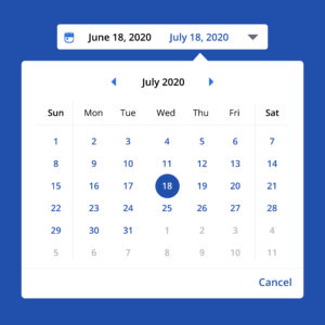
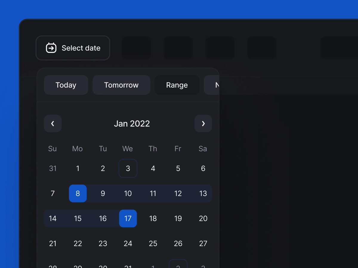
This is a field where you can allow your app users to either select day, month and year in a single step or select it separately. This could either be input as text, or the user can click on the calendar icon from where the date can be selected. This is what the calendar clickable date picker looks like:
You can also use the dropdown box option where the user is shown three boxes for month, date and year respectively. The date range is from 1-31, month range from 1-12 and year dropdown will show all past, current and future years. Here is an example of the dropdown box format:
Equal Focus on Empty State
It is important to know that an empty state field should be as clear to your user as a filled out state is. When the fields are empty, users should be shown relevant input field’s actual numbers. For example, the acceptable date and time format should be shown on the field when the user hasn’t typed or interacted with this field. Here is a good example of the empty state of date design being quite visible and clear to the user:
Validation and Error Handling
This is one of the key UI elements when designing the date picker for mobile apps. At times, there are certain rules or pure logic that a user might overlook. For example, if you are selecting two dates in your travel app, one is for departure and the other one is for return, your return date cannot be sooner than your departure date. Here is a good example:
Whenever there is an error, the user should not only be notified about the error, but should also be provided with a suggestion to make it correct like this.
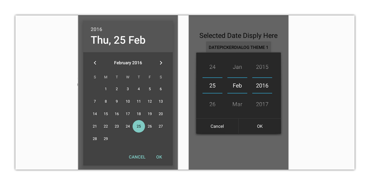
How to Show Current Date in Date Picker Control
It might sound very simple. However, when you are designing an effective date control picker according to your app, you might get confused as to how your user will be seeing today’s date. Below are two comparisons made between two calendar layout designs – Windows 10 and Google. You will observe that the way today’s date is shown in these two calendars is different. Windows 10 date calendar design highlights the current selection more than today’s date, this is something not advisable (this has been addressed by Windows 10 already).
Non-selectable Field Clarity
You need to make sure that your user knows which dates are not available for selection. Making your user click on an unavailable date and later telling them that the date is already taken by another customer doesn’t give a good impression. Consider the following image:
Date Fields not Part of Current Month
It is not necessary that a month will begin from the start of the week. In this case, it is advised to still show the dates of previous or next months, instead of keeping them empty. This is a good option for the best time picker UX design.
Best Date Picker Examples to Use in 2023
Now let us have a look at some of the best UI date picker examples and concepts that you can get inspiration from for your own mobile app.
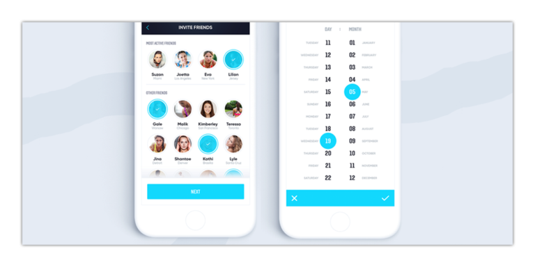
Online Scheduler
Online date scheduling has become a rather common practice on both, mobile and web interfaces these days. If your mobile app doesn’t have a smooth feel to the date picker, your user might not want to use the online scheduler in the first place.

Checkout
Specifically in hotel bookings, the checkout interface is a section that your user will have to interact with. Making it nice and simple, with absolute clarity regarding the dates and/or any period that falls in between the two dates, will increase user engagement and user satisfaction. You can utilize this method both for mobile date picker designs and web date picker designs.
User Dashboard
A lot of web applications and programs these days have their dashboard or admin panels easily accessible through mobile apps. Such dashboards have date picker interfaces for scheduling meetings, task execution, reminders, etc. Here is an example:

Vertical View
Although quite rare in the mobile app date picker UI designs, the vertical view can come in quite handy if you have extra space in the window, or if it suits your business needs.
Keeping it Dark
There are a lot of built-in dark themes and modes in mobile operating systems (OS) these days. Matching your user mobile’s theme with a dark effect can increase user engagement.
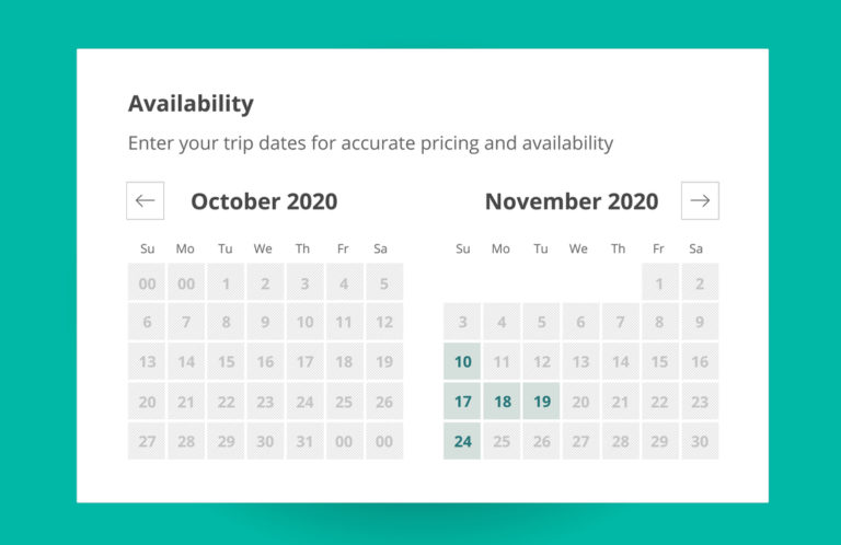
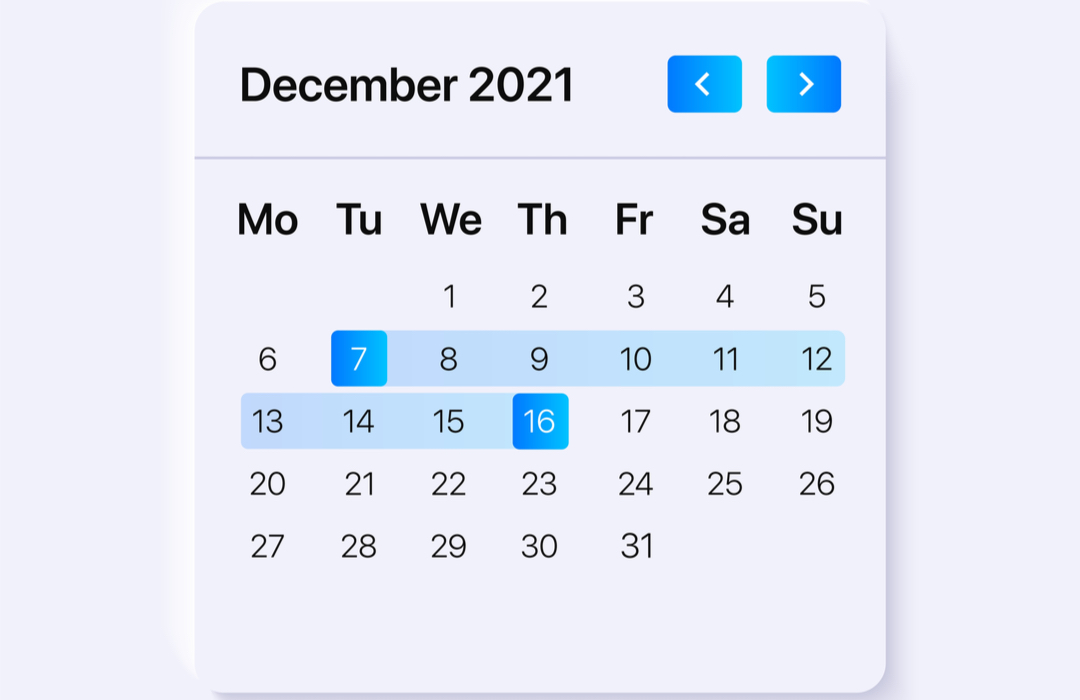
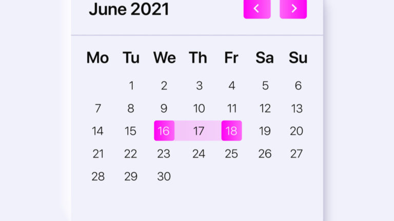
Date Range
When it comes to input date range selection, your user should be able to view all dates, unselected and selected, in a clear manner so that he knows what action he needs to take next in order to complete the transaction.
Flat Design
If you want to keep things nice and simple, the flat style as a calendar design pattern might work for your mobile app. Here is an example:

Floating Design
Float design works for apps that have a similar theme or effect in other app sections or pages as well. If you want to keep a nice balance to your app throughout, your calendar picker can adopt this type of design to keep your UI top-notch. Here is an example of a floating design:
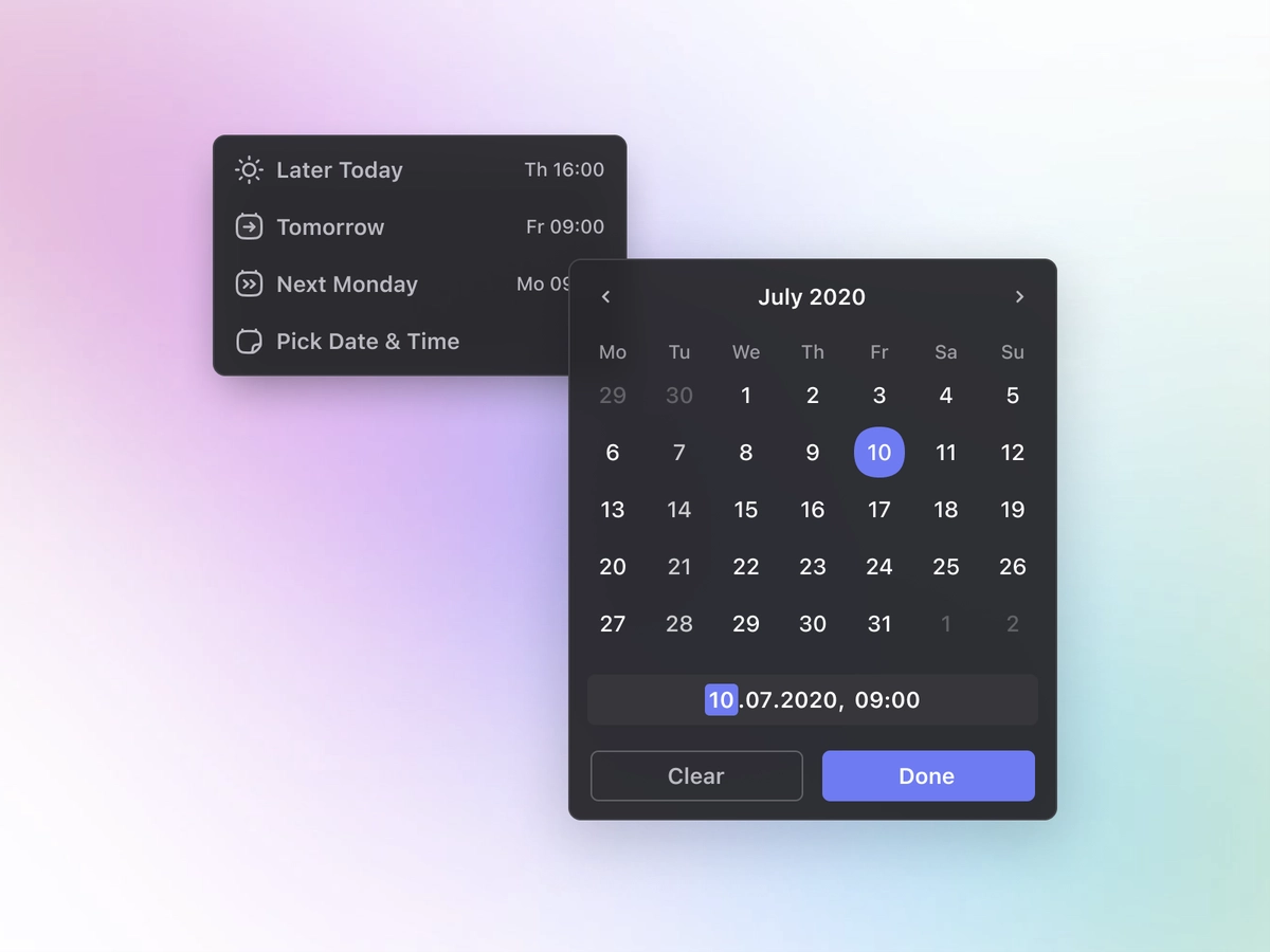
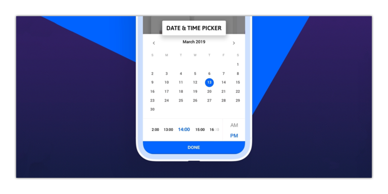
Date Selection with Time
If you have to show the time section as well in your datepicker interface, you can go ahead with a design that looks something like this:
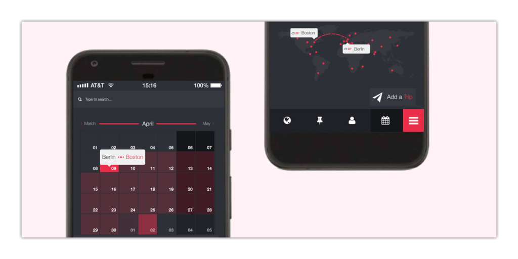
Date Selection with Location
Adding location with your datepicker can give your user to interact with both date and location settings at once.
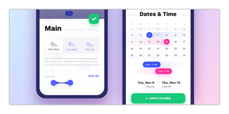
Date Range Enhanced
Here is an optimized version of the modern-day date picker UI interface:
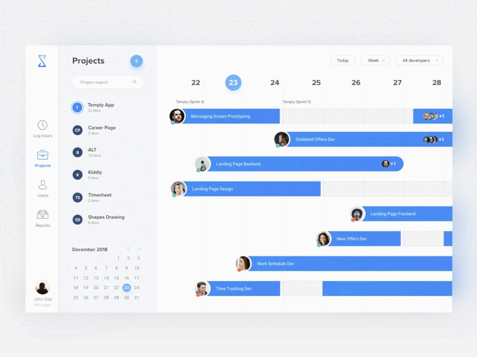
Project Management
Project Management tools have a user dashboard with datepicker interfaces as the one shown below:
SOURCE: BASHOOKA
Designing a Flawless Datepicker – In a Nutshell
There is a lot of design innovation and ideas that can enhance your app’s UI/UX. On the contrary, it can also turn your users away from the app section where they have to fill an online form, schedule an appointment or book a ticket – if your datepicker or timepicker interface is not user-friendly enough. Elements like the input field, calendar themes, calendar overlay, ‘smart’ date and time input will play a vital role in the overall user experience of your app. The datepicker control should not require more than six taps by the user to achieve the desired result. If the user has to tap beyond that number, there is something not right with your datepicker control.
To sum it all up, being a designer, you need to pay a lot of heed to the datepicker UI control and make sure you provide a seamless and smooth user journey throughout that specific app section and eventually, the entire app. If your user has to put in a considerable amount of effort just to select dates, trust me, he would lose interest in your app sooner than you expect.
We hope we gave you loads of inspiration for your datepicker UI and UX for your mobile, app or website. If you want to read more on user experience, then take a look at our Heuristics and usability testing article. This will give you a guide on how to use the most popular UX frameworks to evaluate the usability of your app.


